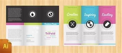
In this article, we want to let you know the significance of brochure design and why it is important for your business to become a brand.
You need to understand that designing a brochure is not easy, but what is difficult is designing a brochure that your clients will keep for longer. The more beneficial your brochure, the extended its life with your receiver, and the greater the odds of it to be passed on to potential clients.
So, to make sure the design of your brochure is in place and aligned perfectly with your marketing plan to make it beneficial for your clients, here are seven essential things you need to consider when designing an effective brochure.

- What is the purpose?
“Objective” is a quite common thing with all types of graphic design services. Having a clear purpose for the brochure is a must.
For whom the brochure is intended? What is the occasion? How are you planning to share it with your client (Physically or digitally)?
Gain as much knowledge about the brochure’s objective so that you can properly select the design for it. It is crucial to note that this design is for communication. All the things you put into the brochure will directly communicate with your audience.
- Choose the right font
A common element that requires much attention when planning any type of graphic design project is the “typeface”.
Fonts determine your text’s readability, set your brochure’s tone, and impact its visual appeal. It is highly recommended to choose the fonts appropriately, and don’t go overboard with distinct styles. Maybe 2 to 3 different styles will be sufficient for the whole copy of your brochure.
- Ensure high quality
A brochure is commonly used in a physical-printed form to share with the clients. That is why it is crucial to stick with high-quality of everything for your brochure design.
Be it the images’ resolution used in a design, the font types, or the icons/logos for the copy. Simply, you can’t get away with low-quality elements when creating something for print.
The actual specification will certainly differ, however, a font resolution and typical image are recommended to be around 300 dpi for any design of brochure to print.
- Check the folds
This is the most important thing to consider when designing your brochure.
Ask a professional graphic designer, and they will tell you how interestingly crucial it is to check your brochure’s folds.
The number and the style of folds that you will give to your brochure is an essential factor since that will directly align with the font style and size as well as the whole design of your brochure.
For instance, a brochure highlighting a sequence of steps, or product features will benefit more with a gate-fold brochure to reveal every step sequentially.
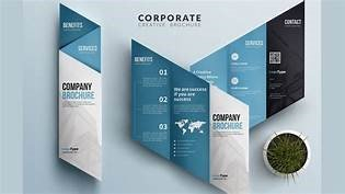
- Visual theme
A visual theme for your brochure helps a lot in making it presentable and shareable.
The benefit of sticking with a theme is that you can also come up with various versions of your brochure design with different color schemes. A strong theme sets the brochure’s tone and offers a consistent user experience for readers.
Having a visual theme for your brochure will also help you set it apart from the rest and have its own unique identity. Anyway, having a creative design of a brochure is highly recommended to ensure a powerful brand identity.
- Don’t forget CTA
Here is where your brochure’s purpose terminates. You should put a proper call-to-action (CTA) that you want your clients to execute through the brochure. That is why it is the most crucial thing to consider and be taken care of when designing an impressive brochure.
If you want to share the brochures digitally, (via social media posts, emails, etc.), then a CTA placed at a perfect location is highly recommended. A proper CTA is also required when you share your brochures offline: print form.
- Review copy
Finally, but very crucially, go through the whole template of brochure that you have prepared before sending it to print. Nothing is more expensive or embarrassing than finding a mistake or typo in a brochure after printing.
Ask these questions to yourself:
- Does this design seize attention?
- Is the message clear?
- Does this design point to CTA?
- Is this brochure in line with the image and identity of your brand?
When you get answers to these questions that fit your requirements, consider your brochure design template to be prepared for publishing.
Conclusion
Designing a brochure can be a cakewalk and fun, but only when you have an ideal template of design in place. If you have no longer done this before, then it can be a bit challenging, but surely not so intimidating.
With these seven essential points, it will be easy for you to design the first brochure of your company.
