Within marketing, sales, product development, web design and actually within many industries, the word UX (which stands for ‘User Experience’) seems to be the buzzword of the 2000s. In short, UX focuses on the interaction between a user and a product. This interaction should be as smooth and easy as possible.
Almost all large companies now hire a UX designer to optimize their product, website or app.
However, there is quite a bit of confusion about the term. Many people think that UX design is a web design-related term, while this is far from the case. Also, UX is often confused with terms like UI, CX, ID, and IA. All these terms are related to UX, but certainly not the same. Uncertainty everywhere, and we are happy to clear up this ambiguity.
In this blog we therefore explain exactly what UX design is. Includes a bit of history and extensive definitions.
How it all started
You could say that UX existed well before Christ. Let’s take a look at some short bits of history that may help us understand where the term UX comes from.
Hundreds of B.C.: UX in the East and in Greece
A beautiful blog by CareerFoundry describes the history of UX in detail, even well before Christ.
A good example of a very early form of UX design is the concept of ‘Feng Shui’. In recent years, several popular books have been written about the ancient Chinese practice of arranging spaces in such a way as to create a harmonious flow of energies (chi). The right furnishing would make a space comfortable and liveable and would make the most of it. So it was not just about the looks of an interior, but also (mainly) about its usability. The technique was already applied thousands of years before Christ in the Far East and reminds us strongly of UX.
Early signs of UX design could also be found in Greece. About 500 BC Hippocrates described how a surgeon’s workshop should be set up. Well lit, comfortable for the surgeon, with all tools logically arranged and within reach. In short, a surgeon’s workplace was fully optimised.
Kitchen drama in 1430
Another great example of UX design in history is that of Leonardo da Vinci, in 1430. We are not sure whether this anecdote is true, but in an Inside Design blog we came across the following story, taken from Michel Gelb’s book ‘ How to think like Leonardo da Vinci’.
The book described how Leonardo da Vinci was asked to furnish a kitchen for a major event. The kitchen had to be prepared to be able to produce as much food as possible, as effectively as possible of course. Da Vinci set to work, equipping the kitchen with conveyor belts to transport food and a sprinkler system in case of fire. Good ideas, but unfortunately the kitchen staff couldn’t handle the conveyor belts and the sprinkler system accidentally went off, which obviously didn’t benefit the food.
The computer age
We could go on with fun anecdotes , but let’s jump to the early computer age anyway.
Around 1970 we slowly started to see more and more UX designers as we know them today. With the advent of the computer, more and more engineers and psychologists dived into consumer computer use. Like the Feng Shui scholars, Hippocrates and Leonardo da Vinci, researchers from the likes of Xerox and Apple worked hard to optimize the usability of their product: In this case computers.
UX gets a name
With more and more scientists working in product optimization, UX finally got a name in 1995. The name was given by Donald Norman, cognitive scientist, during his tenure at Apple. His position, ‘User Experience Architect’, gave rise to the term ‘UX design’.
Norman described:
“I invented the term because I thought human interface and usability were too narrow: I wanted to cover all aspects of the person’s experience with a system, including industrial design, graphics, the interface, the physical interaction, and the manual.”
Donald Norman
UX, what exactly is it?
With a bit of history in mind, hopefully you have been able to build a good picture of UX. To summarize it simply: UX is an extremely broad term. It focuses on an optimal user experience for the consumer during all interaction with a product or service. This can be a website, an app, a physical product, but also a space (as we saw with the Feng Shui scholars, with Hippocrates and in the kitchen of Leonardo da Vinci).
Not clear yet? In this beautiful video, Donald Norman explains.
The duties of a UX designer Digital marketing campany
Due to the broadness of the term, the tasks of a UX designer are also very diverse. However, normally the tasks of the designer can be divided into the following three categories:
1. Research and Strategy
To maximize the ease of use for your consumer, you will need to do extensive research prior to designing your product.
Think about:
- Competition research: What does the competition do well and not well? What can you learn from this?
- Target group research: Who is your target group and what is it looking for?
- Developing a strategy: What are the goals of a design? Who carries out what, what is the plan?
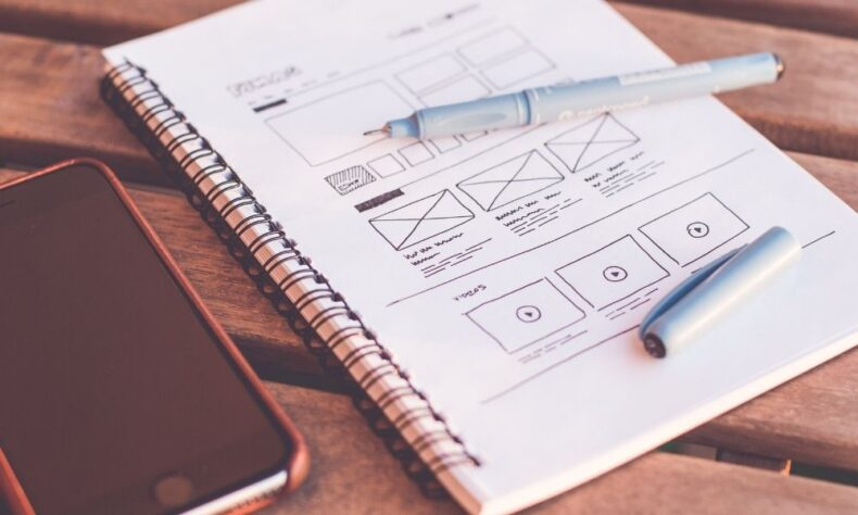
2. Design
After this careful planning, the UX designer is involved in the design of a (digital or non-digital) product. Both ‘ interaction design ‘ and ‘ visual design ‘ are important here. However, interaction design has the main focus of the UX designer; visual design often involves collaboration with UI designers (although in many companies both roles are performed by the same person).
But what exactly is interaction design? As you probably already understand, this is about the (mainly) practical interaction between a consumer and a product. Does a product work quickly and easily? Does the product do what the consumer needs? You can think of the placement of a button on a telephone ( is it in the right place? ) or of a login screen of a website ( is logging in easy and fast? ).
Or, as in the example below, a lift panel. Are all buttons logically placed and easy to operate?
Of course, ease of use goes hand in hand with ‘visual design’. The looks of a product also have a strong impact on its user-friendliness.
For example, are you looking for a ‘login’ button on a website? Then there is a good chance that you will have a hard time finding a dark gray button on a light gray website. A yellow button, however, immediately catches the eye and immediately makes the website more user-friendly. The same applies to the hierarchy and size of the buttons. In general, more important parts are larger. Isn’t this the case? Then this creates confusion. You can clearly see this in the example of the lift panel above.
Can you get the color and layout perfect? Then this has advantages for an existing product (so you ensure satisfied customers) but also for a website on which you sell products. For example, is your big yellow button a CTA? Then there is a good chance that you will significantly increase the conversion of your website with careful UX and UI .
No manual needed
The main reason why the classification needs to be so clear is that people want to be able to use a product without having to study it. Questions during the use of a product quickly lead to irritation.
In the book Don’t Make me Think by Steve Krug this is nicely explained using the Trunk Test. Suppose: You are kidnapped in the back of a car and driven around a city. You will then be kicked out of the car in a place that you do not know. Is a city’s UX well-designed? Then you could easily find your way home with signs and maps on the walls. The same applies to a product or website. Do you have no idea of the operation and layout? Then you should still be able to figure it out, if sufficient attention has been paid to the UX.